Cancer Research UK: Gaining Customer Insight
UX Designer on a UX research project to understand how supporters interact with the Cancer Research UK and improve how they can engage with the charity.
THE BRIEF
Cancer Research is funded by its supporters, from individuals to large global corporations. Many supporters know exactly how they want to support the charity – say by doing a sponsored run – but for those who don’t know what they can do to help, the user experience is confused. The aim of this project was to understand why supporters who don’t know what they want to do are having problems, and suggest improvements.
A secondary aim of this project was to champion a “test and learn” methodology, as part of the charity’s digital transformation programme, promoting evidence decision-making based on test results and data rather than assumptions.
THE JOURNEY
Assumption mapping. The starting point for this project was the Lean UX principle that everything is an assumption until proven otherwise. Assumptions are then prioritised and tested to provide insight.
Kick-off workshop – obtaining stakeholder buy-in
A kickoff workshop was held with all of the project’s stakeholders, including content owners and product managers – about 15 people. Any recommendations the project team make will impact these people – and ultimately they have final say over changes made to the site – so building a close, transpatent relationship with them from the outset is vital. In CRUK, digital ways of working are new, so whilst there is an excitement, there is also a degree of skepticism. Trust is key.
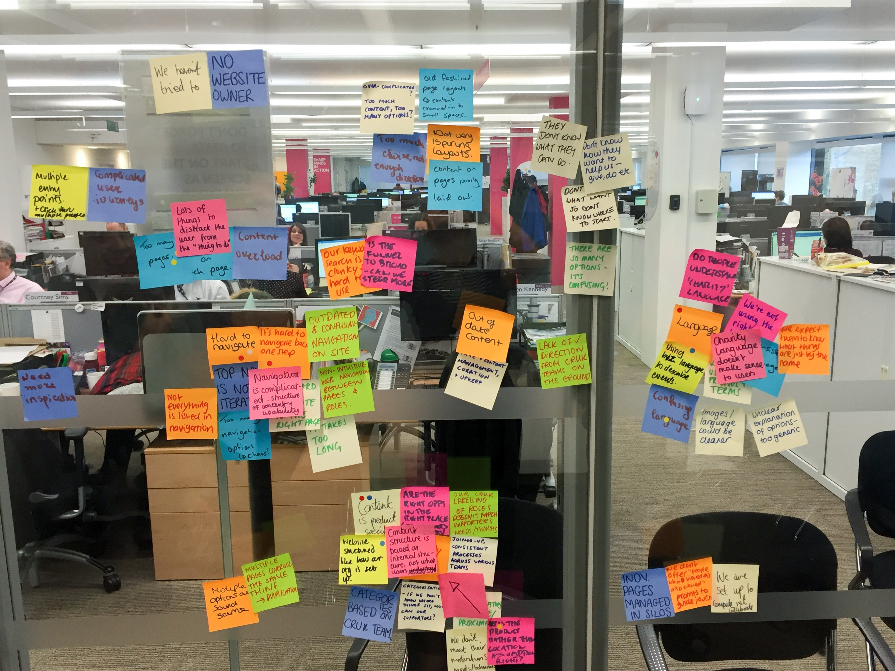
Assumption mapping
The starting point for this project was the Lean UX principle that everything is an assumption until proven otherwise. During the workshop, we asked the business stakeholders to brainstorm why they think supporters are having problems engaging with the charity. This resulted in a broad spectrum of assumptions which were then grouped, removing duplicates. Working as a group, these assumptions were then prioritised, on a matrix of impact vs ease of validation, resulting in a list of assumptions to validate. Examples included: poor IA and menu structure; use of charity language and jargon; to much content and ‘distractions’. This list formed the basis of the following research.
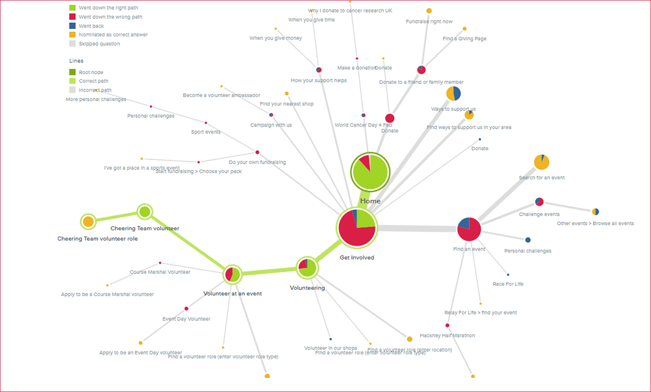
A Tree Test gave an insight into how people interacted with the existing IA, by asking them to carry out key tasks.
Testing, testing….
A variety of tests were carried out to validate the key assumptions. These included:
- Usability testing of current offerings; can participants complete key activities?
- Telephone interviews with volunteers to understand the volunteer supporter experience
- Tree test exercise, to validate the existing IA; can supporters complete key tasks?
- Card sort exercise to discover how participants mentally group activities offered by the charity
- Analysis of heatmaps to understand how users interact with existing pages
- Analysis of Google Analytics data to understand user behaviour and patterns. For example, what are the most popular journeys in this part of the site? What are the most visited pages? What search terms are people using to arrive at pages?
- Comprehension tests to understand if page content was clear
- Guerrilla testing to obtain feedback on proposed offerings
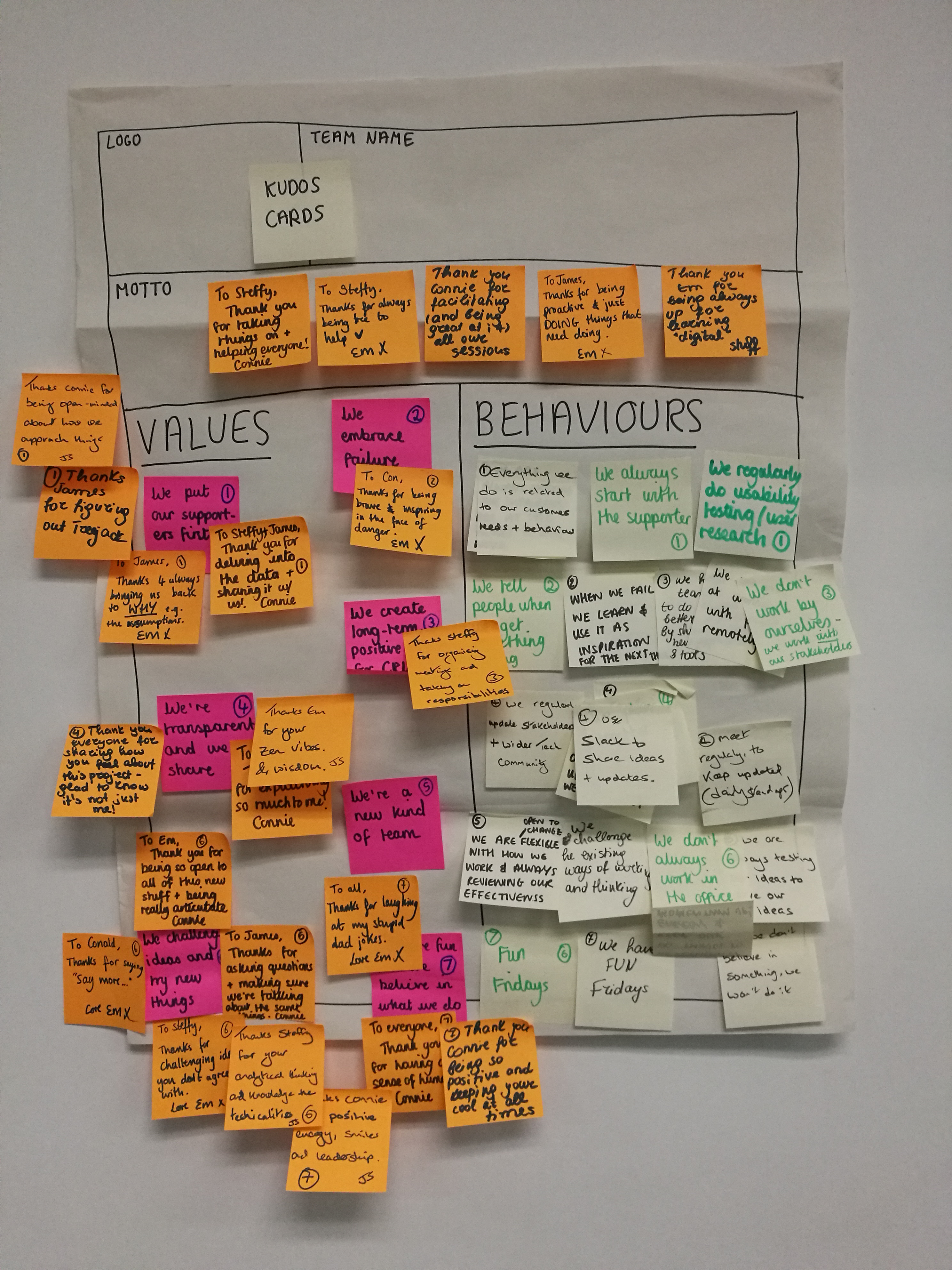
To be successful the right team ethic needs to be developed. The development of a team charter can help in this process, to establish good ways of working.
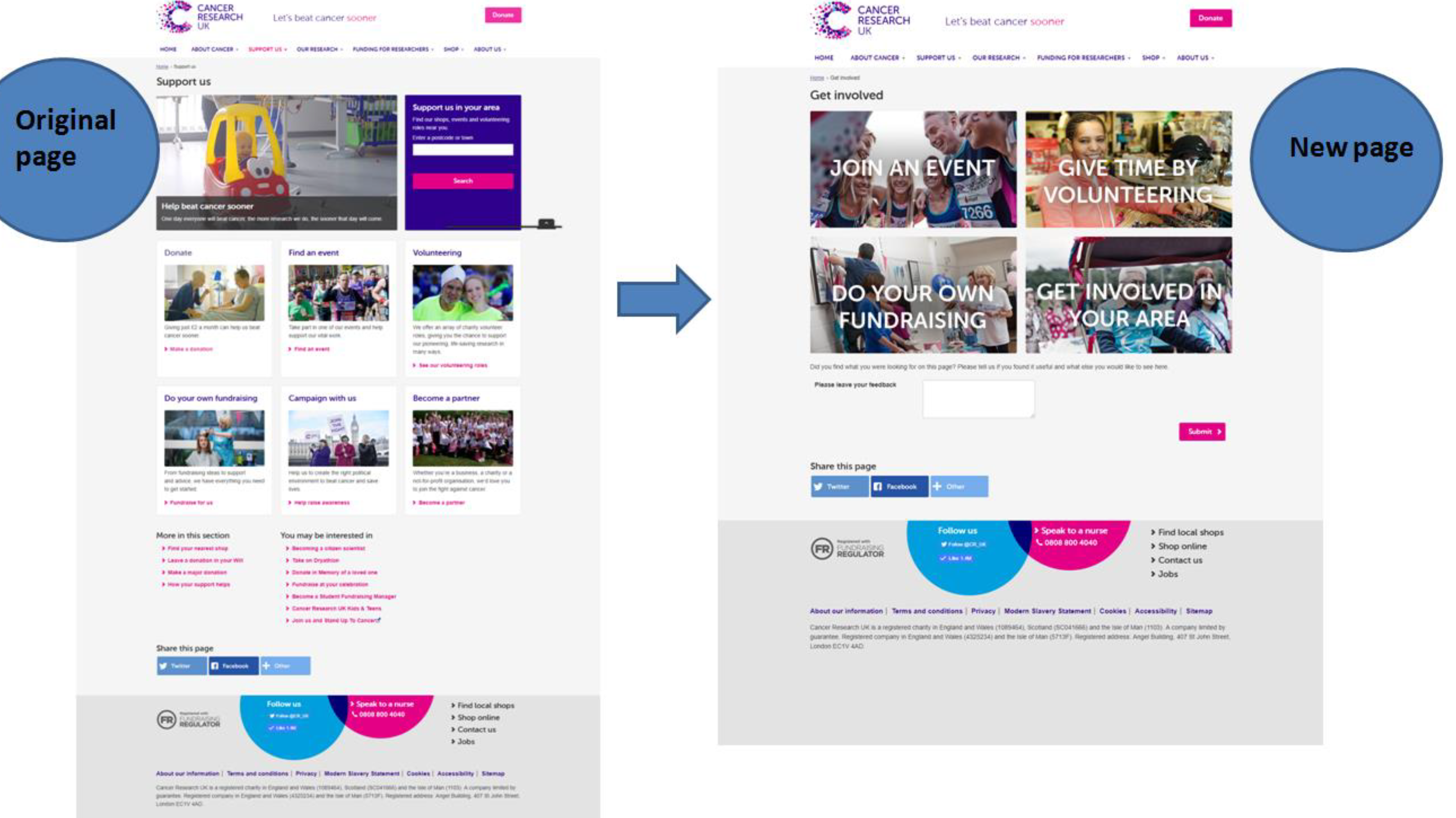
A/B testing proved that a simplified page design improved click-throughs, whilst not cannibalising traffic to other areas of the site.
An Agile approach
The project was run according to an agile philosophy. Sprints were weekly, which is short; I’m used to working to fortnightly sprints, but because the project duration was only 3 months, shorter sprint times were felt to be more appropriate. Stand-ups were held every morning, retros and planning sessions weekly. Trello was used to manage tasks.
CHALLENGES
- Digital thinking at Cancer Research is in it’s infancy, and whilst there was a degree of excitement about a UX approach, there was also a reluctance to make changes, take risks and iterate to improve.
- Poor IT infrastructure meant possible solutions were curtailed by an outdated CMS.
- Access to participants for certain exercises, e.g., tree test, especially in a charity environment.
- Obtaining (properly) completed card sort exercise results – even paid-for results were unusable.
- Lack of data – e.g., inadequate ‘funnels’ set up, so that it wasn’t clear where funding was coming from. This makes ‘data driven decision making’ challenging.
OUTCOMES
The outcome of this project was a series of research findings, customer insights and recommendations for future activity, which were presented to the business stakeholders in the form of a workshop. In this workshop, stakeholders were invited to commit to future actions to progress the project.
In reality, 3 months wasn’t enough time to deliver meaningful change. Whilst a good deal of insight has been gained, assumptions tested and proved and recommendations for change made, a great deal of work has to be done to make significant change. Whether this happens remains to be seen.
TOOLS
- Post-it notes. Lots of them!
- Optimal Workshop – for setting up Tree Test and Card Sort exercises
- Optimisely – for running A/B Tests
- Usability Hub – for comprehension tests and language tests
- Hotjar – for setting up and analysing heat maps
- Google Analytics
- Pencil and paper, for basic sketching, wire-framing and brainstorming
- Axure, for producing wireframes and low-resolution designs